Executive Snapshot
Revenue, margins, headcount trends, and board-ready KPIs in one elegant view. Why chase reports when the essentials can greet you first?
Your database is full of clues. Why let them sit in rows and columns when they could tell a sharper story? We design elegant dashboards that turn SQL reporting into clear, confident decisions for Flint teams.
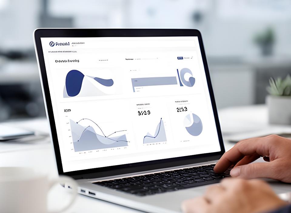
One screen should answer real questions fast. Who needs the numbers? What changed overnight? Where should the next call go?
Revenue, margins, headcount trends, and board-ready KPIs in one elegant view. Why chase reports when the essentials can greet you first?
Orders, inventory, delivery times, and bottlenecks arranged to spot trouble early. Managers can act before the day drifts off track.
Appointments, no-shows, billing metrics, and queue movement laid out clearly. Doesn’t it feel better when the care journey is visible at a glance?
AR/AP, cash flow, and audit trails shaped for clean month-end decisions. Nothing noisy. Nothing buried.
Executives, operators, finance leads, and front-line managers all see the numbers that matter to them. The rest stays quietly out of the way.
Power BI, Tableau, or a custom web app, depending on how your people work best.
Role-based permissions that keep sensitive data in the right hands.
Refresh schedules and handover training so the dashboard stays useful long after launch.
We keep the path simple. No mystery, no jargon pile-up. Just a tidy sequence that gets your SQL reporting from question to launch.
Which decisions need faster answers? We ask the awkward questions early, so the dashboard solves the right problem from day one.
We map the tables, check refresh logic, and spot the gaps. Clean inputs make clean visuals. Simple as that.
Before we build, we sketch the layout and hierarchy. That means less back-and-forth and a dashboard that feels considered.
Charts, filters, measures, and access controls come together here. The data starts to move with purpose.
We watch real users click, question, and react. What gets ignored gets removed. What gets used gets polished.
Your team gets a practical handover, not a thick manual no one opens. Then the dashboard earns its place on the desk.
Before the dashboard, Monday mornings disappeared into manual Excel reports for patient billing. The team had the data, but not the time. After launch, one daily refresh replaced the scramble, highlighting outstanding claims and overdue tasks in a clean, readable format.
We recovered $18k in missed claims in the first month.
The office manager wanted fewer surprises, faster billing visibility, and a dashboard the whole team could trust. We delivered exactly that, without making the process feel heavy.
Click around. Filter the chart. Switch the view. This is the kind of clarity your team could have tomorrow, not next quarter.
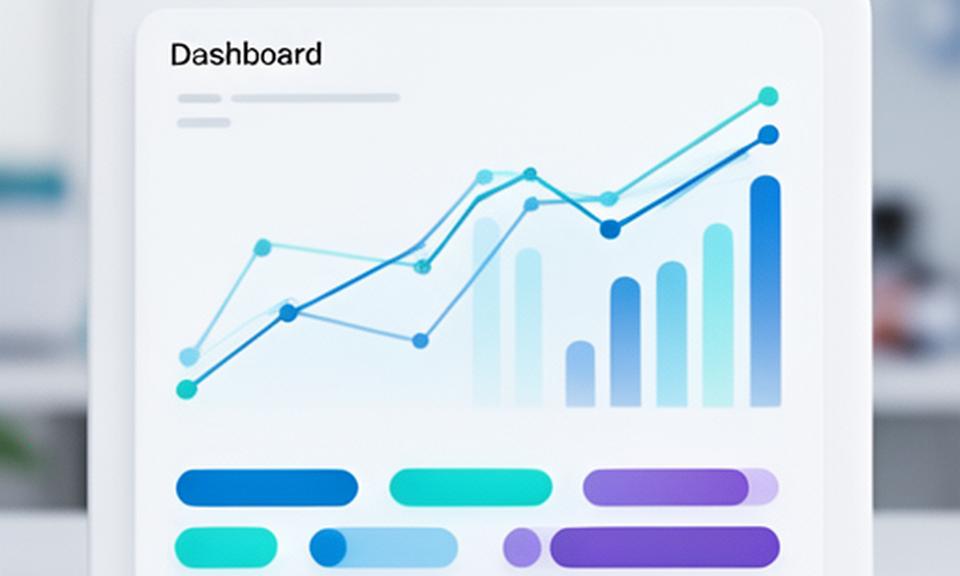
A good dashboard should reduce friction, not add another chore. That’s the difference people notice first.
If the numbers are already there, why not make them beautiful and useful? Share your goal, and we’ll sketch a mock-up that shows what’s possible.